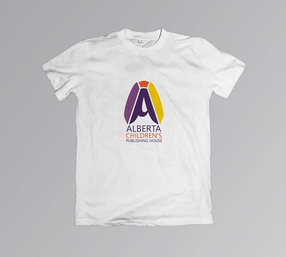
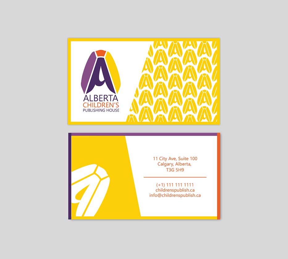
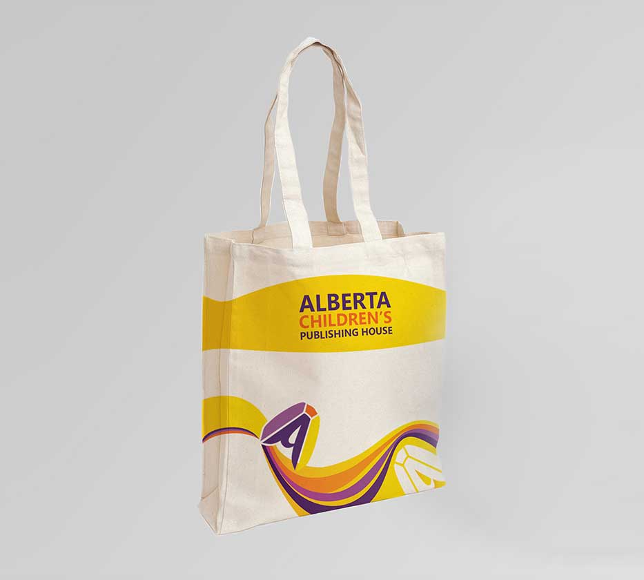
Alberta Children's Publishing House
Graphic Design, Identity
Client: Personal
Corporate identity for this company speaks for itself. Colors are bright, the logo is simple and meaningful. The main element - letter "A" symbolizes an open book. This logo can be easily minimized to fit on a book spine, while preserving its visual clarity.